
Revitalizing Sounding Board's brand to bridge the leadership gap.
— Brand identity / 2024
A confident, premium identity system that repositioned a leadership-development platform for top-tier global enterprises, including Intel, EY, and Cloudera. Strategy, voice, logo, color, type, photography, and a phased rollout, recalibrated and governed end-to-end.
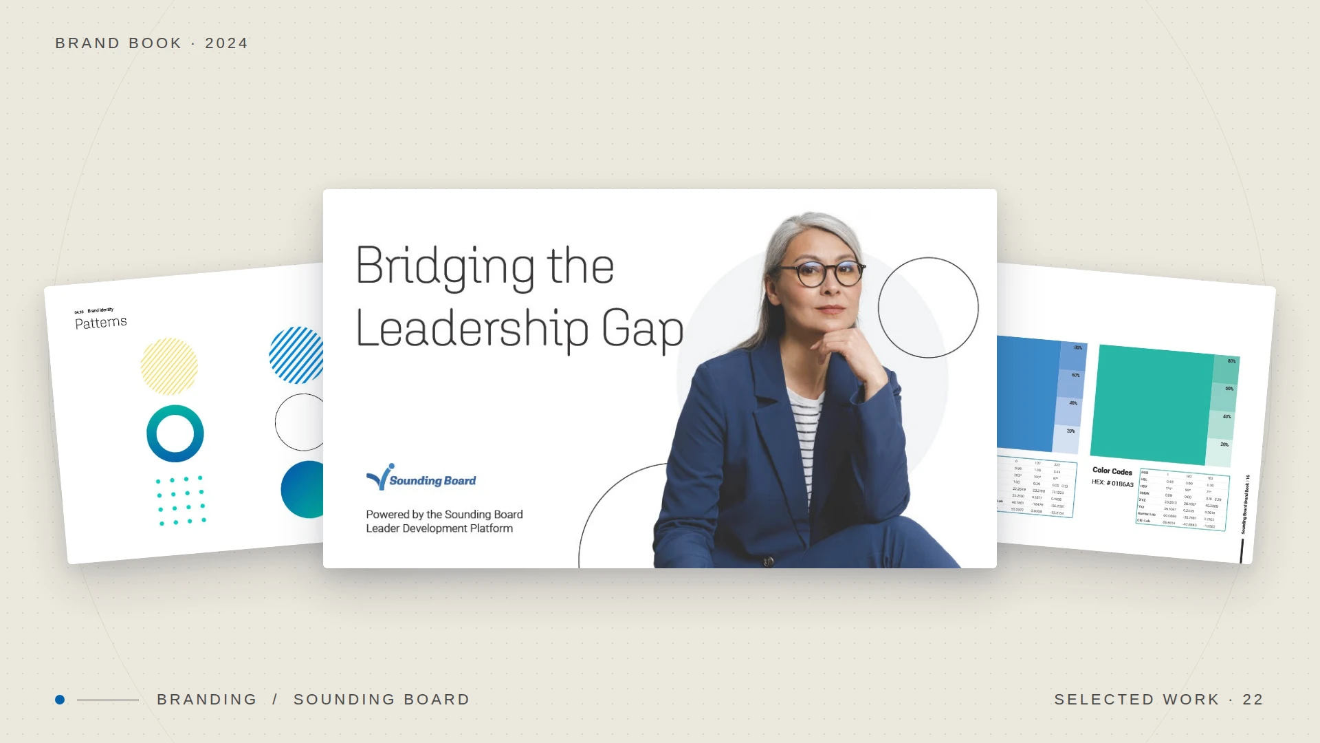
— 01 / The challenge
Strategic context
A category-defining product, wearing a coaching-marketplace face.
Sounding Board had built one of the most adaptive leadership-development platforms on the market: solution design, adaptive software, people-to-people coaching, and proprietary data, all flexing to an organization's people strategy. But the brand still read like a coaching marketplace, not the enterprise platform it had become.
The buyers it needed to win, talent and L&D leaders at Intel, EY, and Cloudera, were evaluating a six-figure investment. The identity had to signal the same sophistication as the product, and tell one story end-to-end: bridging the leadership gap.
77%
of companies say leadership is important or very important.
15%
say they are ready or very ready with leadership. That distance is the gap.
The product bridged the leadership gap. The brand had to look like it could.
— 02 / Foundation
Internal brand & vision
Before a single pixel: defining who the brand is.
I started inside the company, not in the design file. The brand book opens with an internal brand: a corporate philosophy that turns employees at every level into ambassadors of the company's values, so the identity ships consistently from sales call to product UI.
That foundation gave every downstream decision a reason. The vision became the north star; the single statement became the line every asset had to earn.
§ 01.1 — Vision
Creating the world's most impactful leaders.
Single statement: Bridging the leadership gap · Powered by the Leader Development Platform
Six brand attributes
A personality framework anchored every word and image. Each attribute pairs a definition with a first-person belief the team could actually live by.
— 01
Leadership
The character that gives a person the confidence to lead others. "We are leaders, and leaders of leaders, not followers."
— 02
Adaptive
Flexible when needed; able to fit the conditions of its environment. "We help others adapt. We are not rigid."
— 03
Premium
Reflecting superior quality and value. "We compete on strategic value, not on price."
— 04
Transformative
Having the power, or tendency, to transform. "We help people and organizations grow, change, improve."
— 05
Collaborative
A group who work together toward a shared goal. "Working together produces better results than working alone."
— 06
Authentic
Genuine and original; not false or of doubtful origin. "We are true to ourselves and what we believe."
Sounding Board bridges the leadership gap with the world's first Leader Development Platform, driving the people change that matters: hiring, retention, engagement, and DE&I.
— 03 / Voice & tone
Verbal identity
One voice. A tone that reads the room.
To stand out in a hyper-competitive segment, the brand needed a distinct, consistent voice across every internal and external touchpoint, aligned to the six attributes and to the customer's real pain points in HR and L&D.
The voice — constant
Straightforward and confident.
- No jargon. Educate without confusing.
- Occasionally provocative: just enough humor to stay interesting, never crossing the line.
- Active, not passive.
- Positive and precise: lead with the good, then provide solutions.
The tone — adaptive
Informal, but never casual.
Casual undercuts the premium investment our corporate customers make. Informal keeps us from sounding stuffy, or worse, boring.
Clarity beats entertainment. We read the audience's state of mind (are they in need? confused on a sales call?) and adjust accordingly. We have a sense of humor, but we never force the joke.
— 04 / The mark
Logo & usage
A mark that reaches upward.
The symbol is a rising figure, an upward check formed from the dynamic gradient that runs through the whole system. It reads at once as a person ascending and as progress confirmed: the visual shorthand for closing the gap.
I documented clear-space, minimum sizing, and the full set of approved treatments (primary on light, knockout on ink) so the mark stays unmistakable from a favicon to a conference banner.
Primary lockup — on brand field

Knockout — on ink
Logo system — primary & knockoutBrand Book § 04.3
— 05 / Color
Palette system
A palette built to feel technical and human.
Three primaries carry the brand: a deep, trustworthy blue, a brighter digital blue, and a signature teal that energizes the system. A secondary set adds a light teal, true black, and a warm yellow accent for moments that need to pop. Every value ships with an 80/60/40/20 tint ramp for flexible, accessible application.
Primary blueDeep Blue#0561AD
Digital blueBright Blue#0089DF
SignatureTeal#01B6A3
Light tealMint#60CFC3
NeutralBlack#000000
Accent popYellow#FEDC4C
— 06 / Type
Typographic system
Aglet for character. Roboto for clarity.
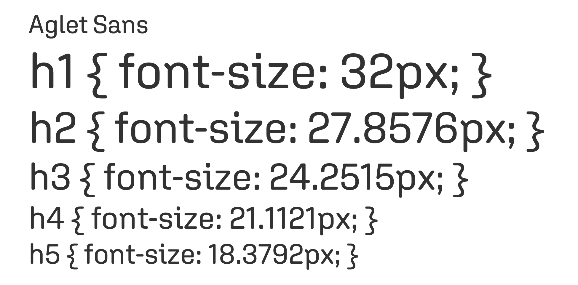
Aglet Sans, a soft, confident rounded grotesque, carries headlines and gives the brand its friendly-but-premium character. Roboto handles body copy: neutral, screen-tested, endlessly legible. A modular scale (1.15 ratio) keeps every heading level in proportion from h1 down to fine print.
Primary — displayAglet Sans

Secondary — bodyRoboto
Lorem ipsum dolor sit amet, consectetur adipiscing elit, sed do eiusmod tempor incididunt ut labore et dolore magna aliqua.
Type hierarchy — modular scaleBrand Book § 04.8
— 07 / System
Pattern · icon · image
The parts that make it feel like one brand.
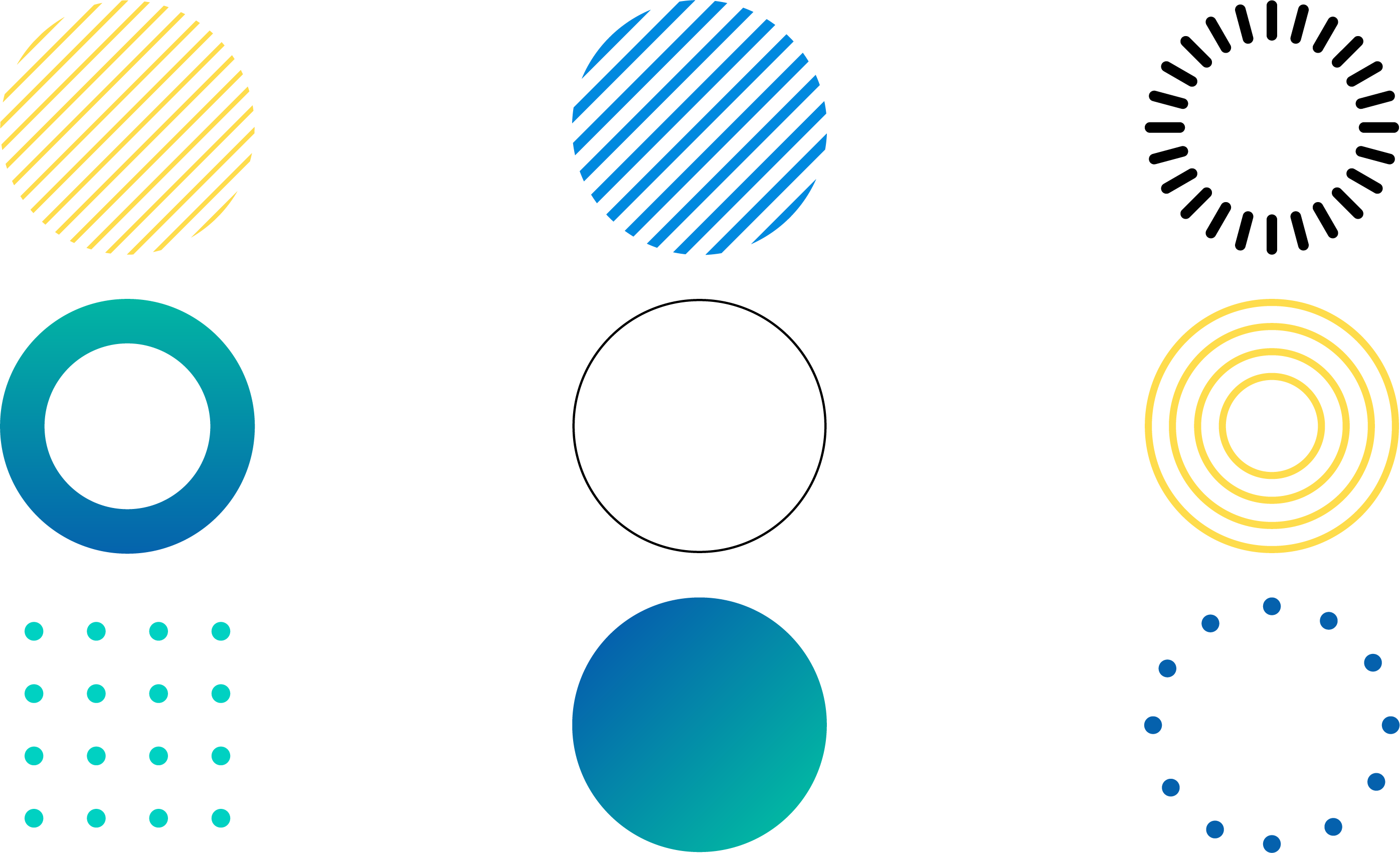
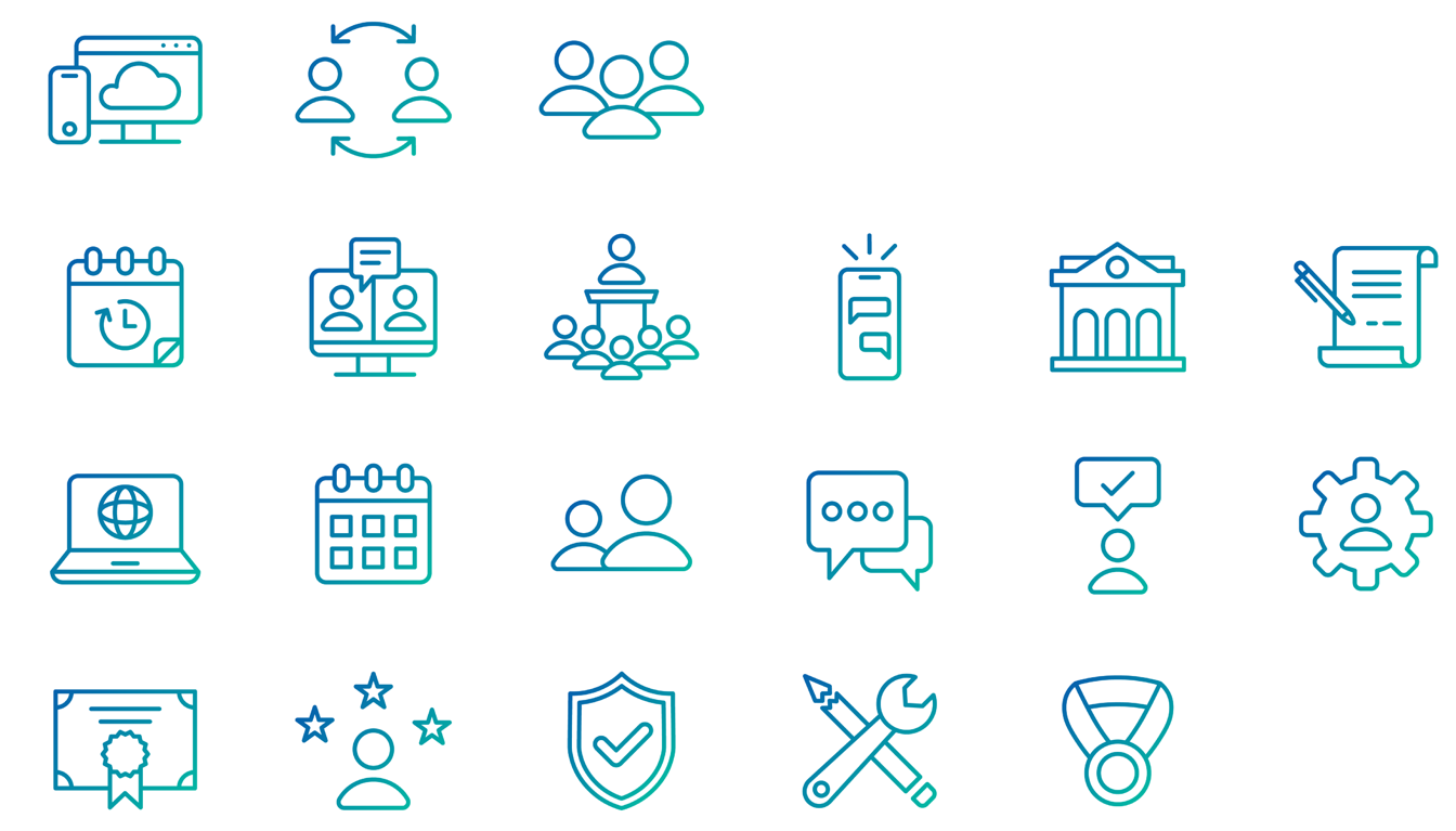
Beyond logo, color, and type, a brand lives or dies on its connective tissue. I built three supporting libraries so anyone, designer or not, could produce on-brand work at speed.
Patterns — geometric§ 04.10
Iconography — line set§ 04.11
Images & mood
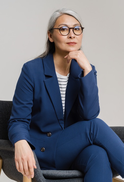
Photography is real, warm, and confident: leaders mid-thought, never stock-stiff. Natural light, shallow depth, neutral grounds that let the brand color lead. The art direction makes a global, multigenerational workforce the hero.





Mood & image style — leaders, not stockBrand Book § 04.9
— 08 / Rollout
Launch & governance
A brand is only as strong as its rollout.
Designing the system was half the job; landing it inside the company was the other half. I built the brand book as the single source of truth, then drove a phased rollout: an all-hands reveal, team-by-team deep dives, and a kit of decks and templates so every function could apply the brand without me in the room.
Phase 1 — live
Reveal & equip
All-hands brand reveal on Dec 5. Brand overview deck, story deck, and the guidelines document shipped company-wide.
Phase 2 — next
Team deep dives
Working sessions for Sales, CS, and CET, translating the system into the artifacts each team uses every day.
Phase 3 — ongoing
Govern & scale
Supporting templates, rolling updates, and an AI-augmented workflow that doubled creative output without growing the team.
The day it launched, the new identity shipped consistently, because everyone had the system, the story, and the tools at the same time.
— 09 / In the wild
Applied across media
One system, every surface.
A brand system earns its keep once it leaves the guidelines. Over the year that followed, the identity ran across the marketing site, the trade-show floor, long-form editorial, paid social, and film. Same logo, same voice, same gradient, on every surface a buyer actually touched. A few of those applications:
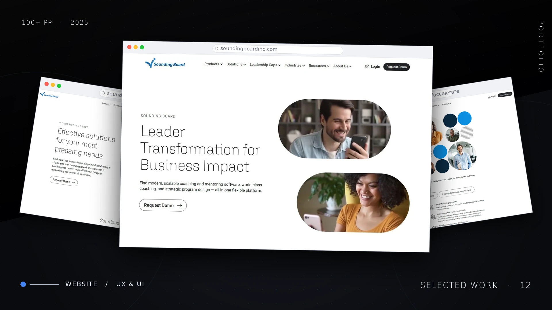
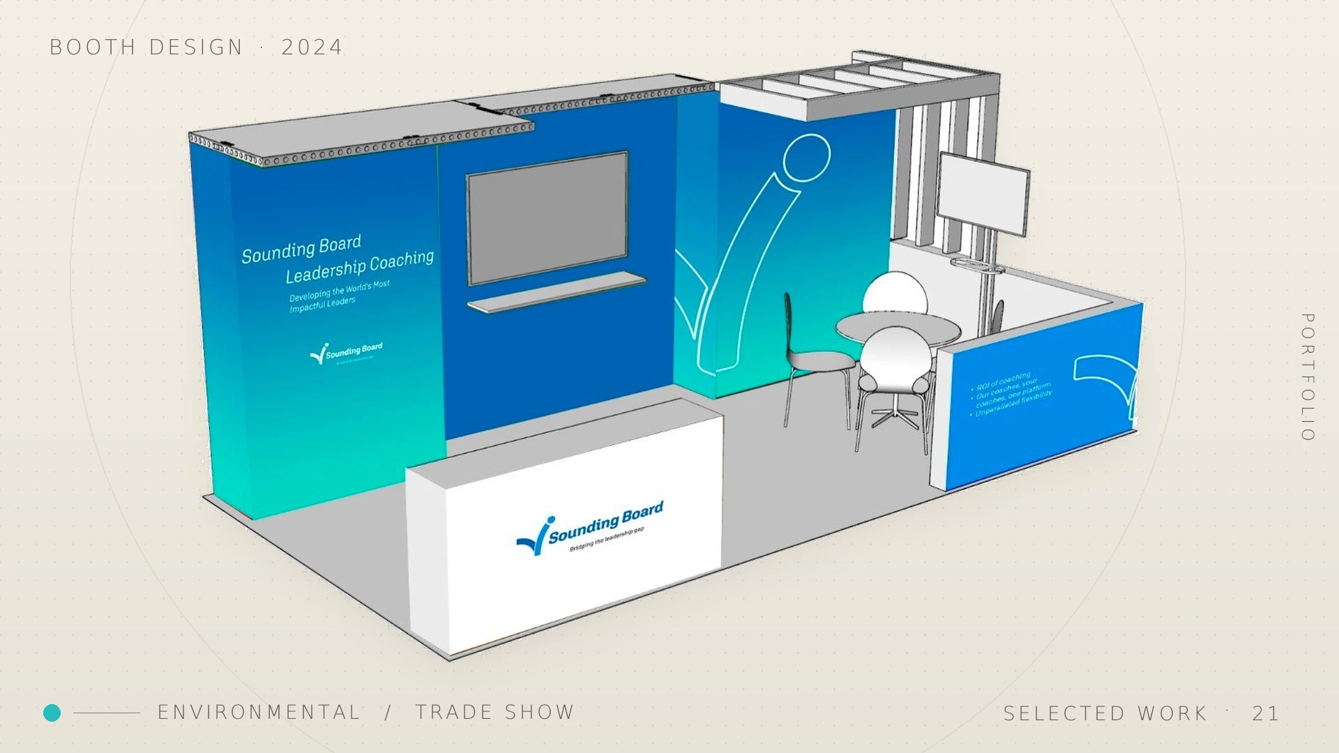
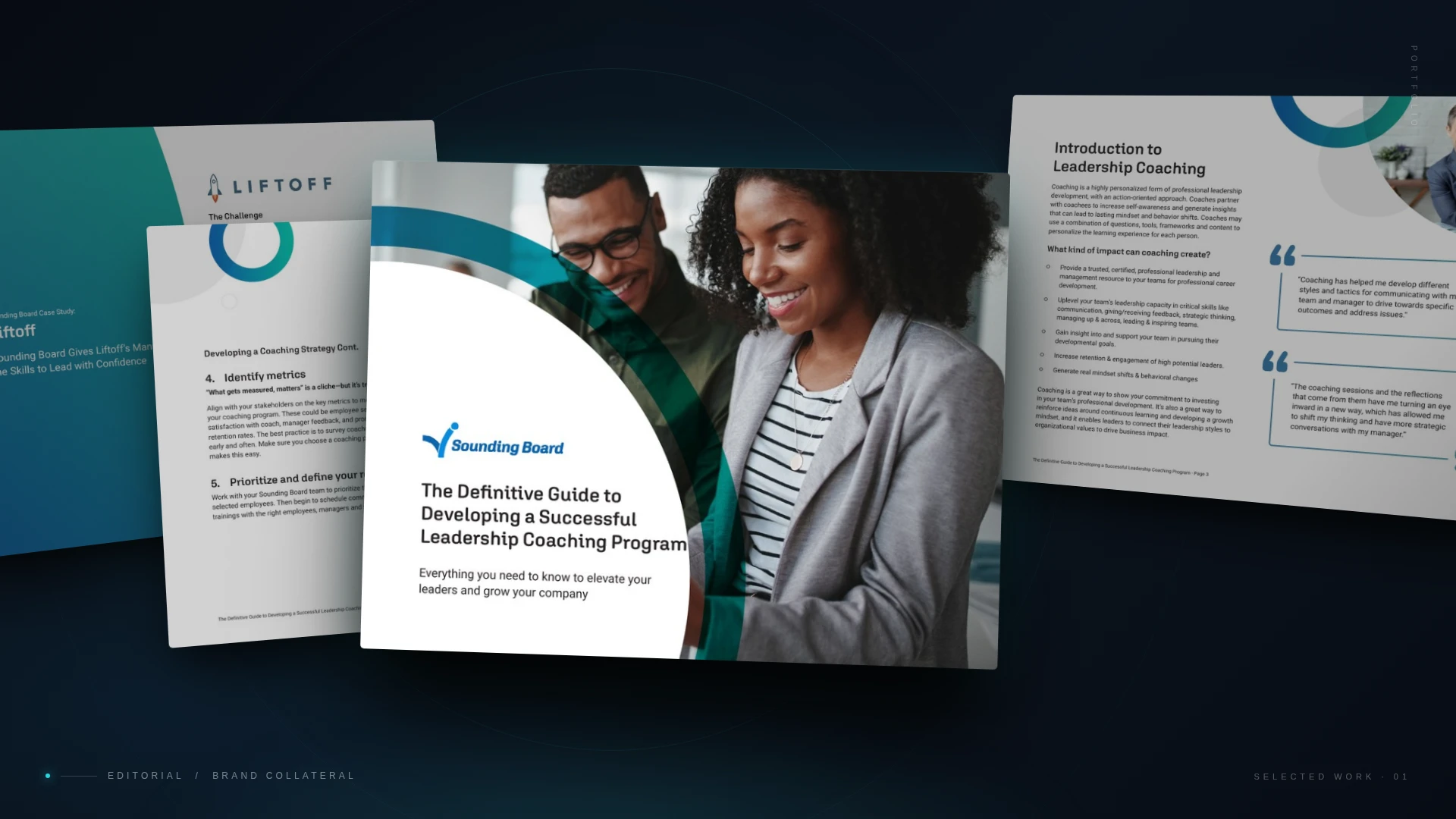
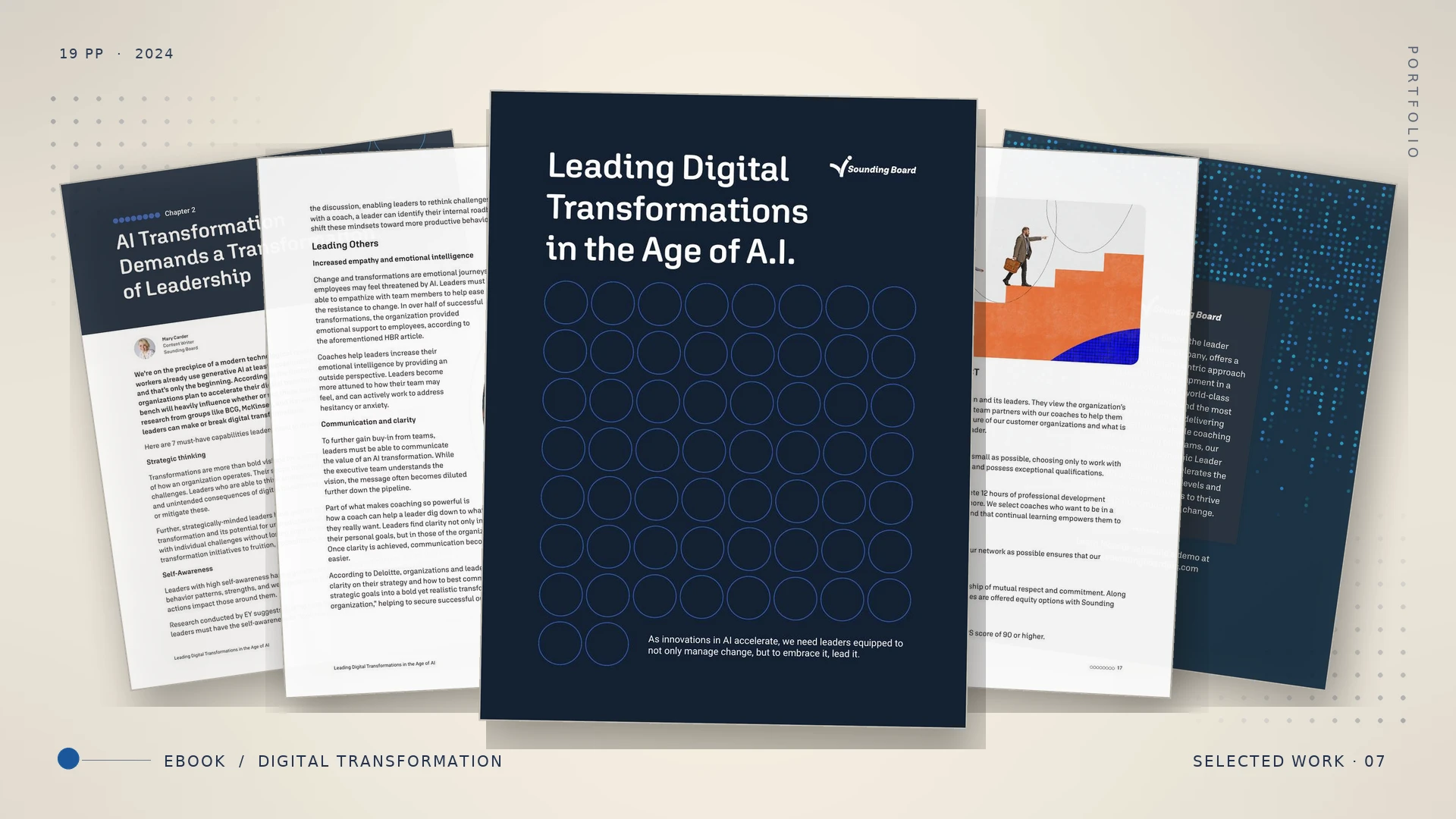
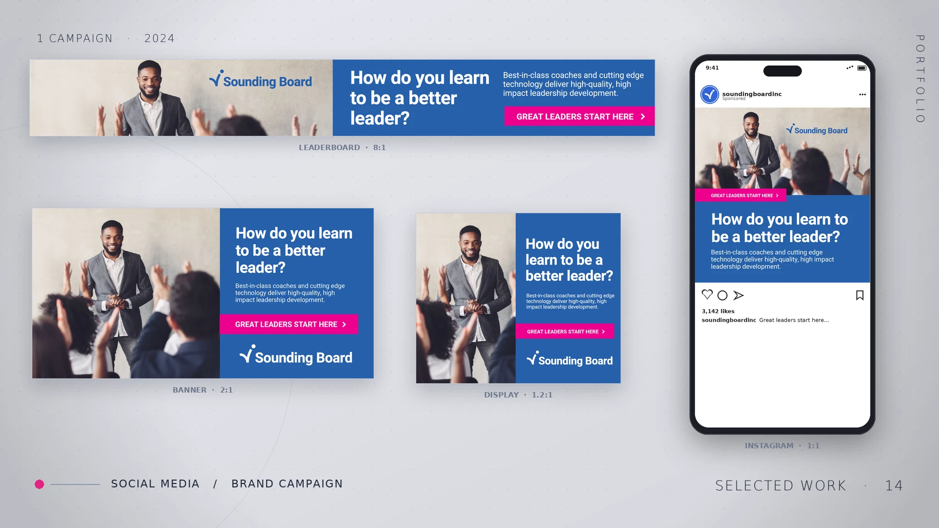
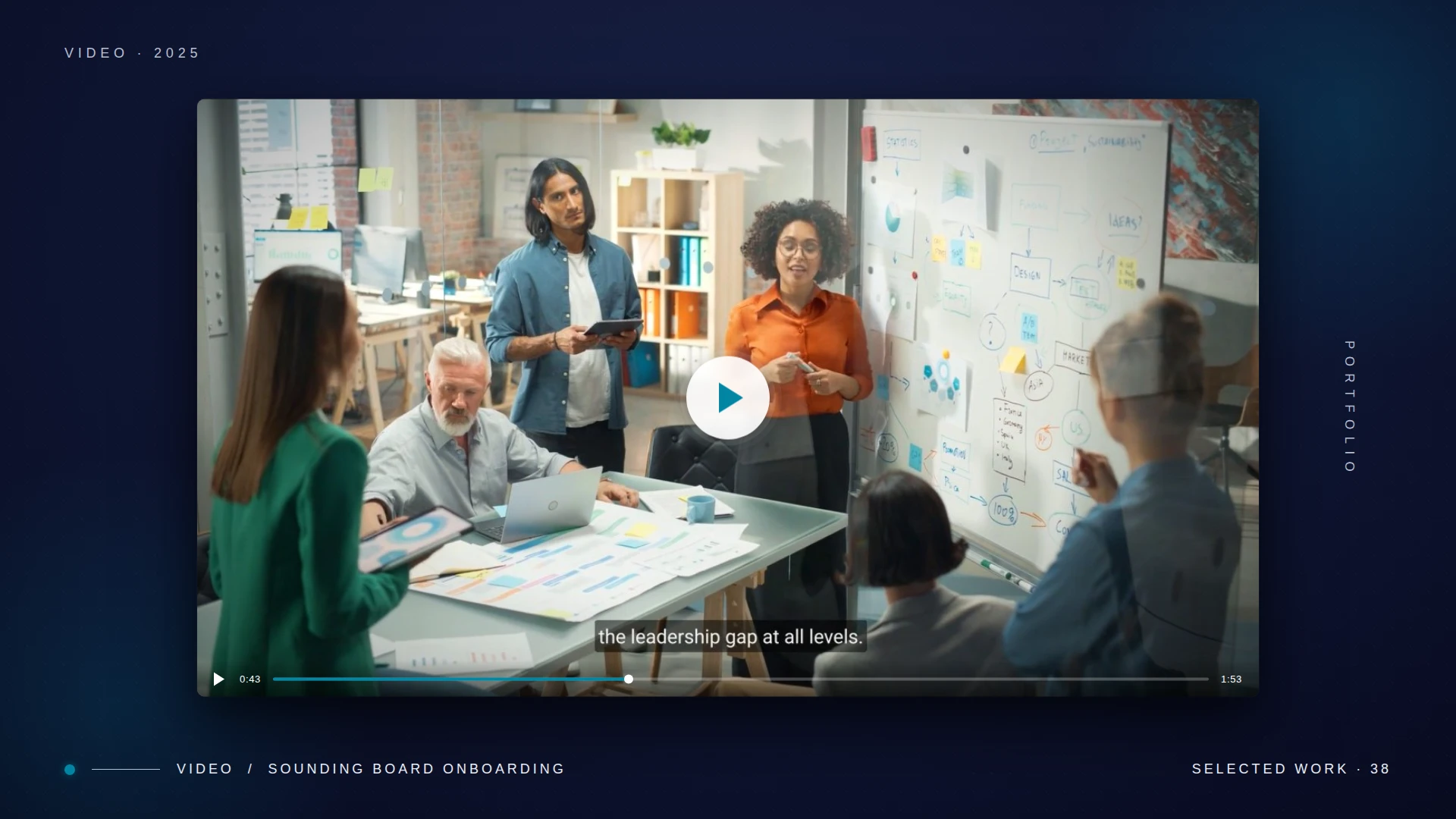
Selected applications — web, environmental, editorial, social, film2023 — 2024
— 10 / Impact
What changed
One claim, one customer, every surface.
Within two quarters the system was producing measurable lift across every revenue surface, because every artifact finally pointed at the same claim and the same customer. The refresh anchored Fortune 500 acquisition and a category-defining "Leader Development Platform" position.
↑ Tier
Repositioned for premium, enterprise leadership buyers.
3
Flagship logos (Intel, EY, Cloudera) anchored to the new story.
2×
Creative output via an AI-augmented design workflow.
1
Source of truth: logo, color, type, voice, and usage in one book.