Revitalizing Sounding Board's brand to bridge the leadership gap.
— Brand identity / 2024
A confident, premium identity system that repositioned a leadership-development platform for top-tier global enterprises, including Intel, EY, and Cloudera. Brand voice, visual language, and design system, recalibrated end-to-end.

— What
Scope & deliverables
What was made.
— Why
Strategic context
Why it mattered.
— Impact
What changed
What changed.
— 01
The system
One structure, five varieties.
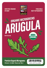
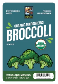
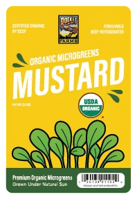
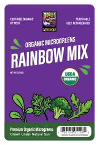
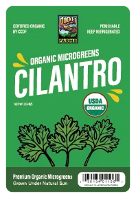
Rocket Farms grows five microgreens that look almost the same through a clamshell lid. The label has to do the work of telling them apart, so I built it as a system instead of five separate designs. Everything stays fixed except two things: the color and the illustration.
Here are the five labels as they ship. Same brand block, same eyebrow, same flavor type, same USDA seal, same trust bar at the bottom. Change the color and the drawing, and you have the next flavor.
— 02
Architecture
Anatomy of one label.
ACompliance row. The CCOF certifier, the Rocket Farms mark, and the "keep refrigerated" warning sit in a fixed three-up grid at the top of every label.
BEyebrow and flavor. "Organic Microgreens" in small caps sits over the variety name in heavy condensed type. It is the loudest element, sized to read across an aisle.
CIllustration. A hand-drawn picture of the actual green, centered. It gives the label warmth that photographed produce graphics tend to miss.
DUSDA seal. Placed in the same spot every time, so the organic claim stays clear against any color.
ETrust bar. A white footer with "Grown Under Natural Sun" and the barcode anchors every label and keeps scanning reliable.
Set the structure once, and a new flavor is just a color and a drawing away.
Front · shelf face
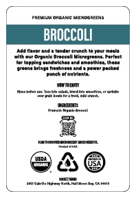 Back · usage & certifications
— 03
Color
A color you can shop by.
Each variety owns a strong, high-contrast color that holds white type cleanly and reads from a distance. Repeat shoppers learn the color before they read the word. Crimson is arugula, gold is mustard. That kind of shorthand makes the shelf easier to scan and brings people back to the right pack.
ArugulaCrimson#A4163A
BroccoliTeal#2D5A60
MustardGold#F2B50A
Rainbow MixViolet#56298A
CilantroGreen#2A9C3E
— 04
Typography
Heavy, condensed, easy to read.
The flavor name uses a bold condensed typeface. It is wide enough to fill the label and tight enough to stay on one line at any length, from "Mustard" to "Rainbow Mix." A small-caps eyebrow and a monospaced compliance line handle the supporting text, so the order of information stays the same on every pack.
Display · flavor name
Broccoli
EyebrowOrganic Microgreens · 600 small caps
Trust lineGrown Under Natural Sun · 600
ComplianceCCOF · NET WT · mono caps
— 05
Illustration
Drawn by hand, on purpose.
Photography would have made five greens look like one. Instead, each variety gets its own line-and-fill drawing of the real plant: arugula's lobed leaf, broccoli's florets, cilantro's feathered fronds. The hand-drawn look reads as farm, not factory, and it gives the higher price something real to stand on.
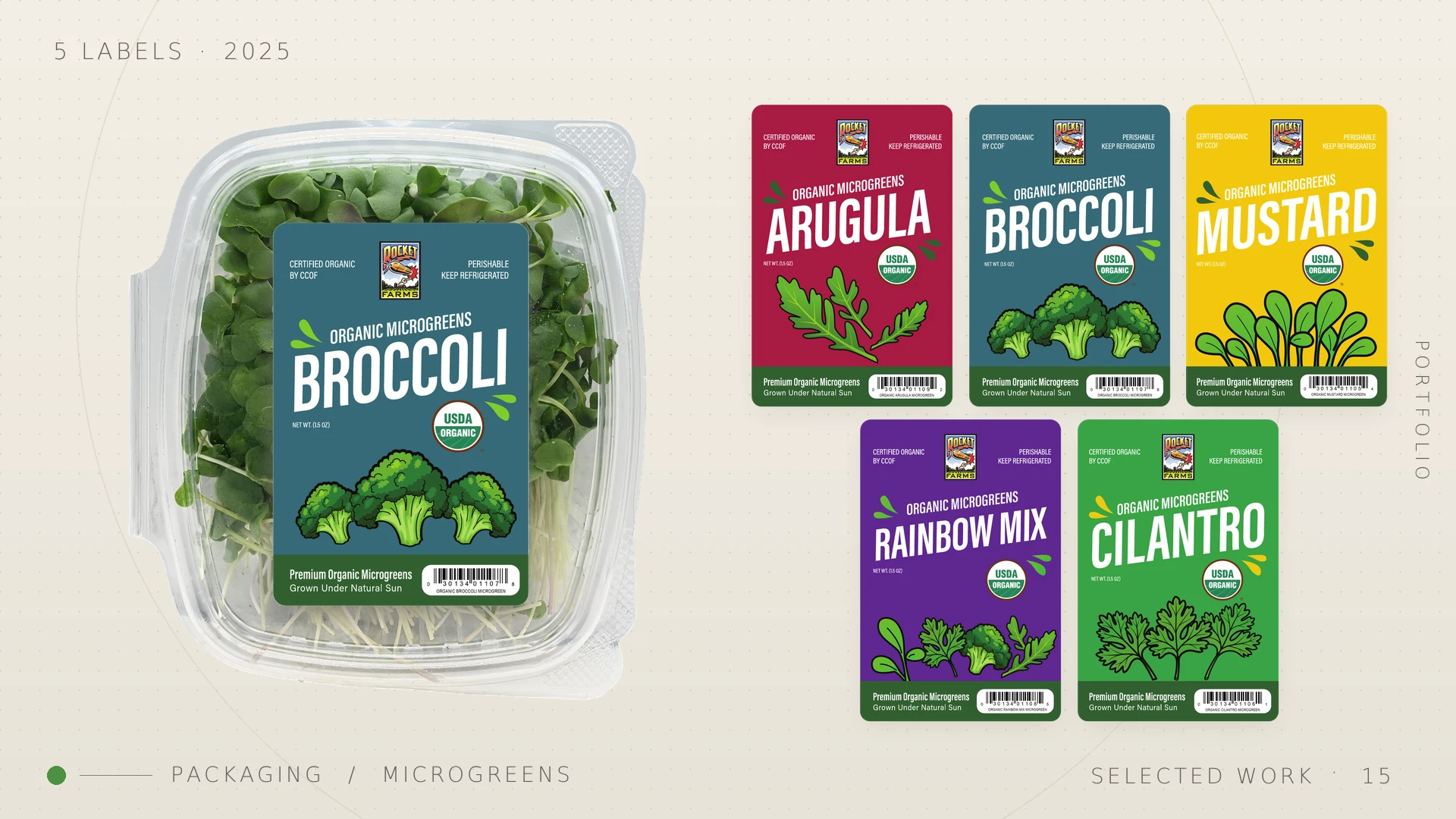
Full line · 2025Five bespoke illustrations, one system
— 06
Why it holds
Built to add the sixth.
— Stays the same
The structure
The brand block, eyebrow, seal, and trust bar carry over to any new variety without changes.
— Changes
Color and drawing
A new flavor needs one color and one illustration. That is a few hours of work, not a rebrand.
— The payoff
Shelf trust
Consistent compliance and organic cues make the whole line read as one credible brand.
— 07
What it returned
A line that scales itself.
5Flavor SKUs from one master label
2Things change per variety: color and drawing
1Shelf identity unifying the full line
∞Future varieties the system absorbs
The takeaway
When the product can't set itself apart, the system has to. So design the rule, not just the label.
Rocket Farms · Microgreens packaging · 2025