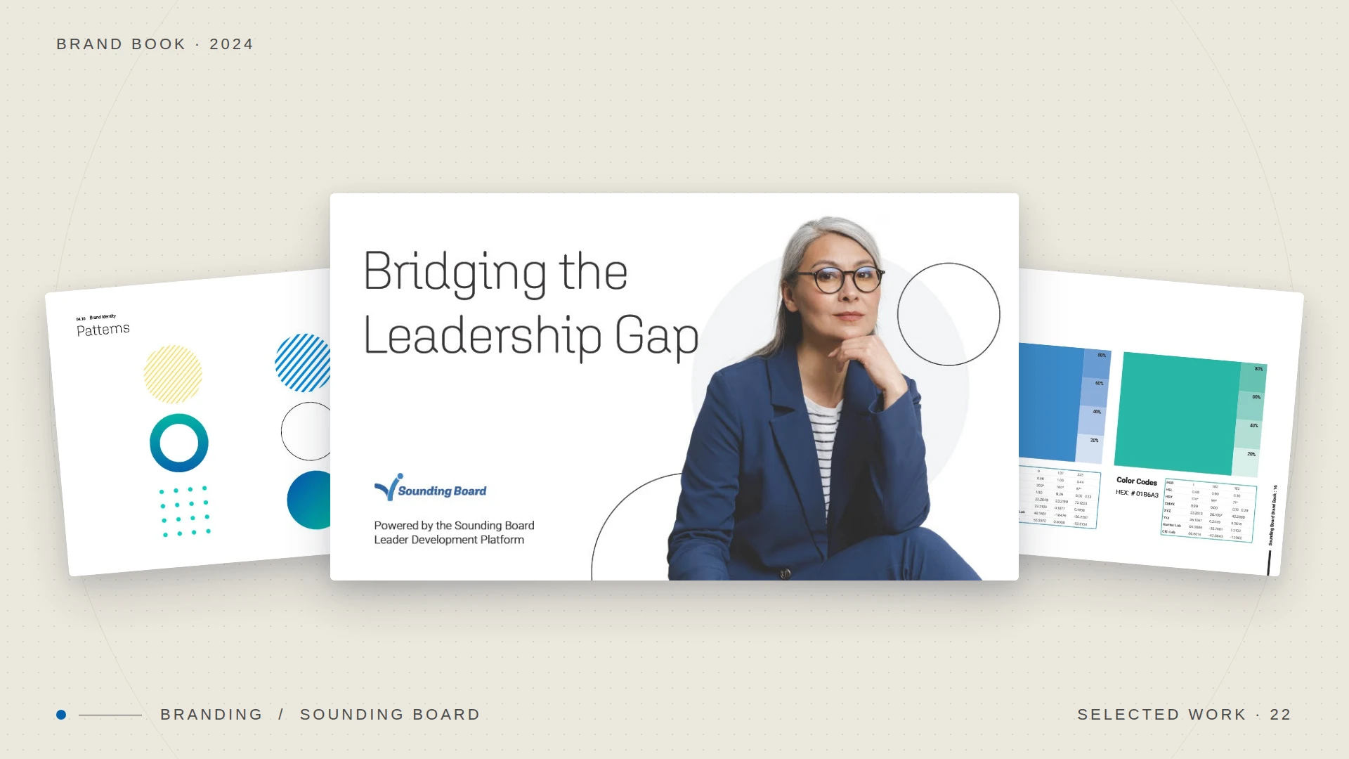
Revitalizing Sounding Board's brand to bridge the leadership gap.
— Brand identity / 2024
A confident, premium identity system that repositioned a leadership-development platform for top-tier global enterprises, including Intel, EY, and Cloudera. Brand voice, visual language, and design system, recalibrated end-to-end.
— What
Scope & deliverables
What was made.
— Why
Strategic context
Why it mattered.
— Impact
What changed
What changed.
— 01
The system
One chassis. Two glows.
Lumina is built so the brand lives in everything except the color. The wordmark, the lockup, the arc, the wine ink, the margins: those are fixed. The only variable per flavor is the light: a single gradient field that fills the pouch from a cool sky to a warm finish.
Vanilla Dawn and Berry Radiant are the same package wearing two different times of day. Identical structure; different temperature. That is the entire system rendered below, not a mockup but the live rules.
Sky → cream → peach · slate → coral → return
Same chrome, swapped field
— 02
Color
A wine constant, a shifting light.
One ink does all the talking: a deep wine that reads as premium on every field without ever competing with it. Everything else is a gradient: a continuous ramp rather than a fixed swatch, so the eye reads "glow" instead of "block of color."
Ink · constantWine#5D2440
Dawn · openSky#A9CEDD
Dawn · closeCream#EFE4CA
Berry · openSlate#45598F
Berry · closeCoral#E89A8E
— 03
Typography
High-contrast serif, set in small caps.
A single typeface carries the whole brand. The wordmark is a high-contrast serif in full caps; the descriptor and tagline are the same face tracked wide in small caps. No second font, no sans. The restraint is the premium signal.
Vanilla Dawn
Lumina
Glow from Strength
Wordmark · caps, +40 tracking
Descriptor · small caps, +360
Tagline · small caps, +280
— 04
Structure
Five rules hold the face together.
01
Center axis
Everything stacks on one vertical line. Symmetry is the structural constant: it reads the same on a shelf, a thumbnail, or a story frame.
02
Fixed order
Descriptor, wordmark, tagline, support line, weight: always in that sequence, never re-ranked. Hierarchy is decided once, then locked.
03
The arc
A single thin ring sits behind the mark, the "glow" made geometric. It is the one ownable graphic device, identical across every SKU.
04
Quiet margins
Generous, equal breathing room on all four sides. The field does the work; the type never crowds it.
05
Anchored weight
The 200 GR figure is pinned to the base as a fixed foot, balancing the descriptor at the top of the axis.
The brand is the structure. The flavor is only the light passing through it.
— 05
The extension
A second SKU is the system's stress test.
You only find out whether a package is a system when you build the second one. Berry Radiant reused every rule on this page (axis, order, arc, margins, wordmark) and changed exactly one input: the gradient field. It shipped in days, not weeks.
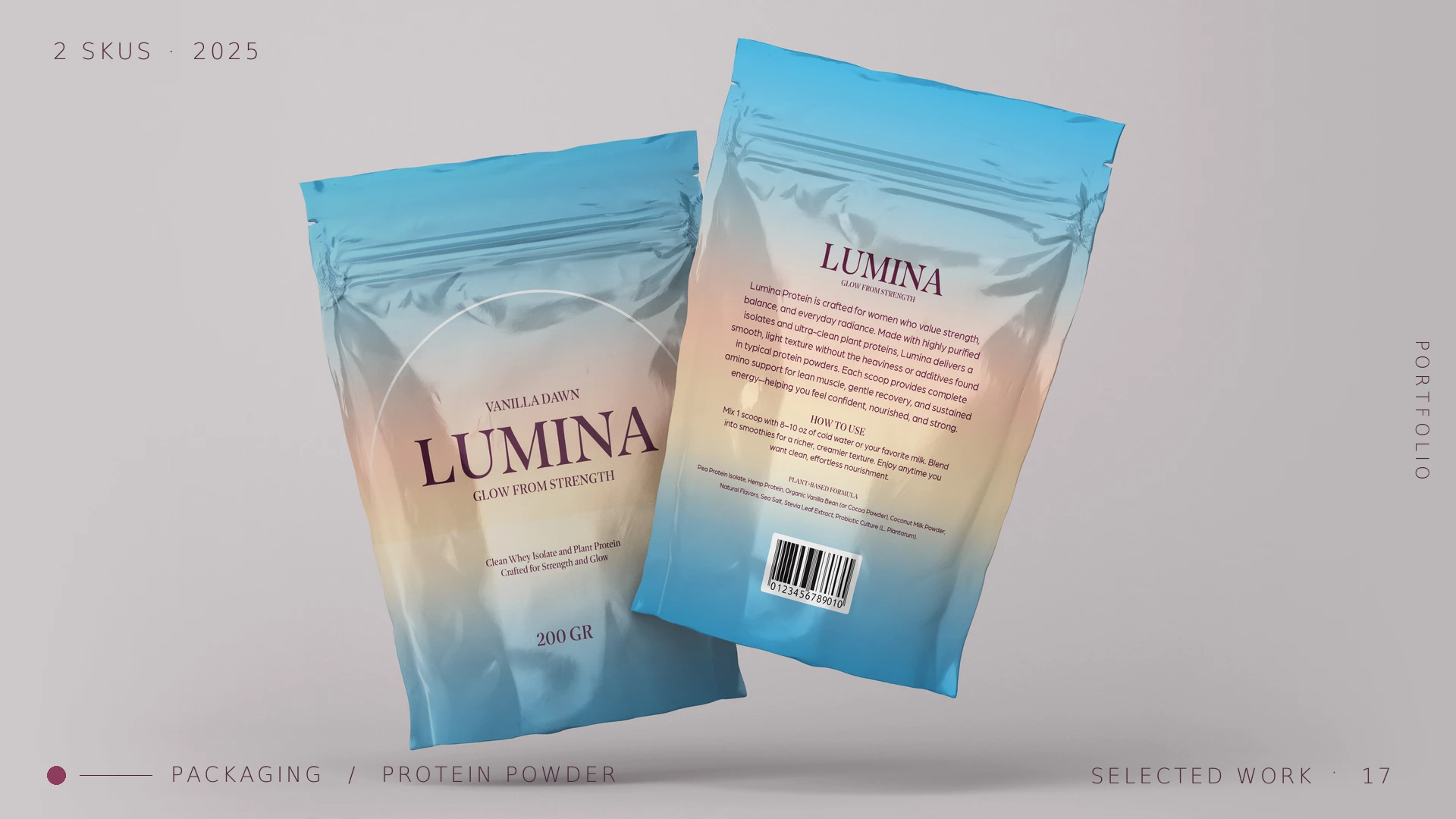
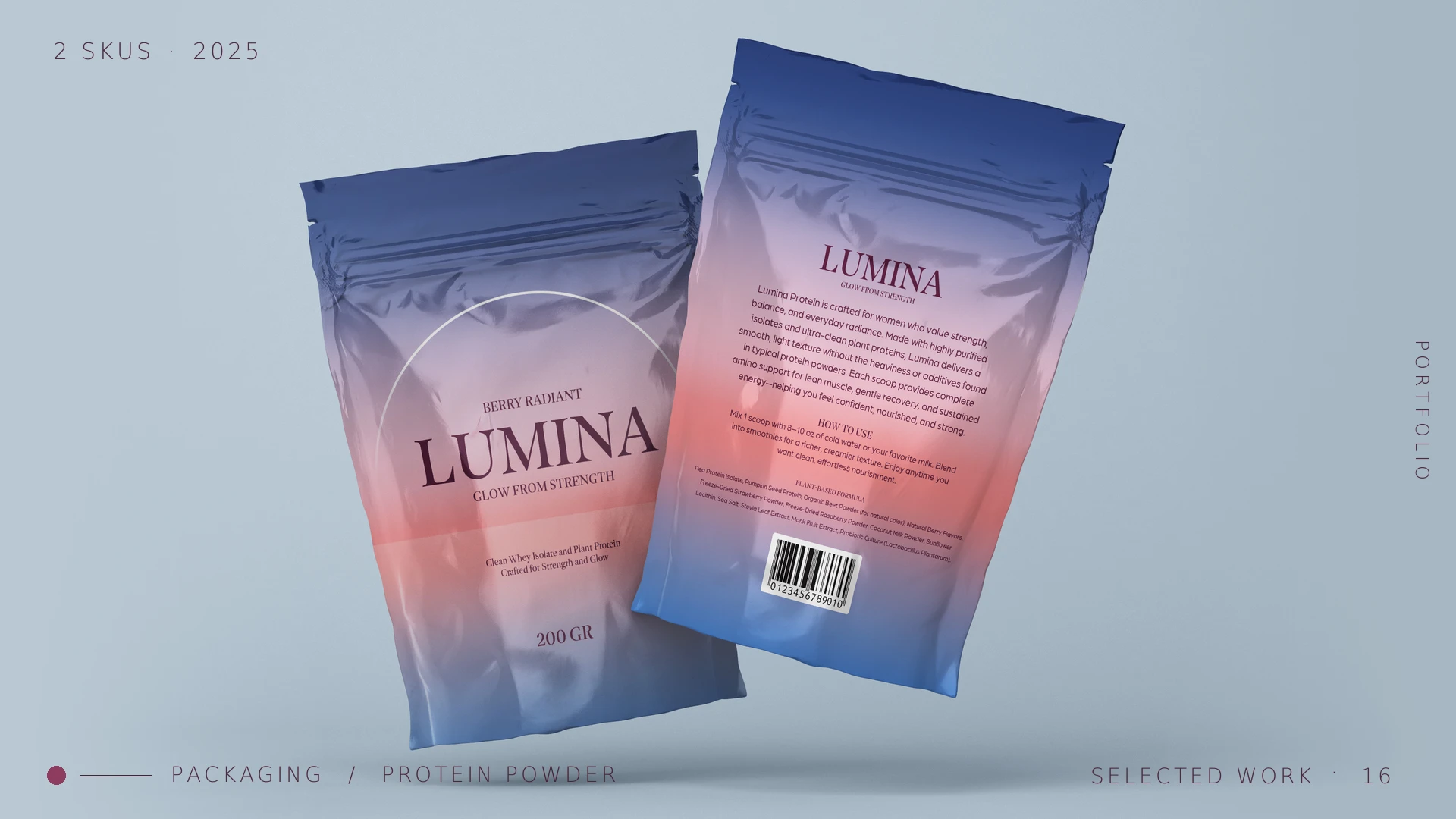
Two SKUs · 2025One system, proven across flavors
— Kept
The wordmark
Same serif, same caps, same tracking. The mark is never redrawn per flavor.
— Kept
The lockup
Axis, order, arc, and margins transfer untouched. The skeleton is shared.
— Changed
The field only
A single gradient is re-mapped to the flavor's temperature. One variable, infinite SKUs.
— 06
What it returned
A system that scales itself.
2×SKUs shipped from one master file
1Variable changed per flavor: the field
~3dFrom brief to print-ready on the extension
0Redrawn brand assets across the line
The takeaway
The best packaging systems don't repeat themselves. They hold one idea so firmly that the next flavor is almost free.
Lumina Protein · Packaging system · 2025