A curated showcase of strategic creative solutions, revealing how innovative thinking transforms complex challenges into compelling brand narratives and measurable outcomes.
Feel free to share a bit about what you’re reaching out for, and I’ll get back to you as soon as I can. Whether it’s a quick question or a deeper conversation, I’m excited to hear from you.
Revitalizing Brand Strategy to Bridge Leadership Gaps at Sounding Board
Transformed Sounding Board’s brand identity, amplifying its leadership platform’s adaptability and premium positioning to attract top-tier global clients.
InDesign
Illustrator
Photoshop
Figma
Highlights
UVP Defined: Positioned Sounding Board as the world’s first Leader Development Platform, bridging leadership gaps.
Brand Voice Update: Created a confident, clear tone tailored to corporate leadership and decision-makers.
Key Attributes: Focused on leadership, adaptability, transformation, and premium positioning in the market.
Visual Identity: Modernized logo, color palette, and iconography to reflect a tech-driven brand.
Client Success: Attracted global clients like Intel, EY, and Cloudera with tailored leadership solutions.
Impact: Strengthened brand recognition, leading to increased client engagement and market positioning.
Establishing Voice, Personality, Vision and Tone
A comprehensive guide designed to help SMB leaders implement scalable leadership coaching programs. Created and designed by me, it combines strategic insights, case studies, and actionable frameworks to drive leadership development and business growth. The design follows a clean, modern, and professional aesthetic, balancing bold typography, strategic whitespace, and subtle brand colors to ensure readability and reinforce credibility. With a polished yet approachable tone, the layout aligns with Sounding Board’s brand identity, making complex information easily digestible.
Client Overview:
Sounding Board is a cutting-edge leader development platform that focuses on empowering organizations to bridge leadership gaps at all levels. Their platform is flexible, adaptive, and tailored to meet the evolving needs of businesses in a fast-changing world. Companies like Intel, EY, and Cloudera rely on Sounding Board for their leadership development needs, particularly around diversity, equity, inclusion, and leadership pipeline growth.
Project Goal:
The goal of this branding project was to refresh Sounding Board’s visual identity and brand voice, aligning it with its innovative, tech-driven approach while emphasizing leadership development, transformation, and flexibility. The project aimed to communicate a clear, distinct identity to prospective clients and partners, reinforcing Sounding Board’s position as a leader in the leadership development space.
Brand Strategy & Positioning:
We defined Sounding Board’s Universal Value Proposition (UVP) as “bridging the leadership gap with the world’s first Leader Development Platform.” This positioning highlights the company’s expertise in leadership development and its unique ability to deliver adaptive, scalable solutions that drive key outcomes, including hiring, retention, engagement, DE&I initiatives, and more.
The updated brand voice was designed to be confident, straightforward, and occasionally provocative, avoiding jargon but ensuring that clients clearly understood Sounding Board’s solutions to their leadership challenges.
Key Brand Attributes:
Leadership: Sounding Board is not just a provider but a leader in leadership development.
Adaptive: Their platform is flexible and can be tailored to meet various organizational needs.
Transformative: The platform aims to bring long-lasting change to the way companies approach leadership development.
Authentic: Sounding Board stays true to its values of empowerment, growth, and trust.
Collaborative: Sounding Board believes in teamwork and the power of collaborative efforts.
Premium: The brand targets high-end, forward-thinking companies, offering premium leadership development solutions.
Design Approach & Brand Identity:
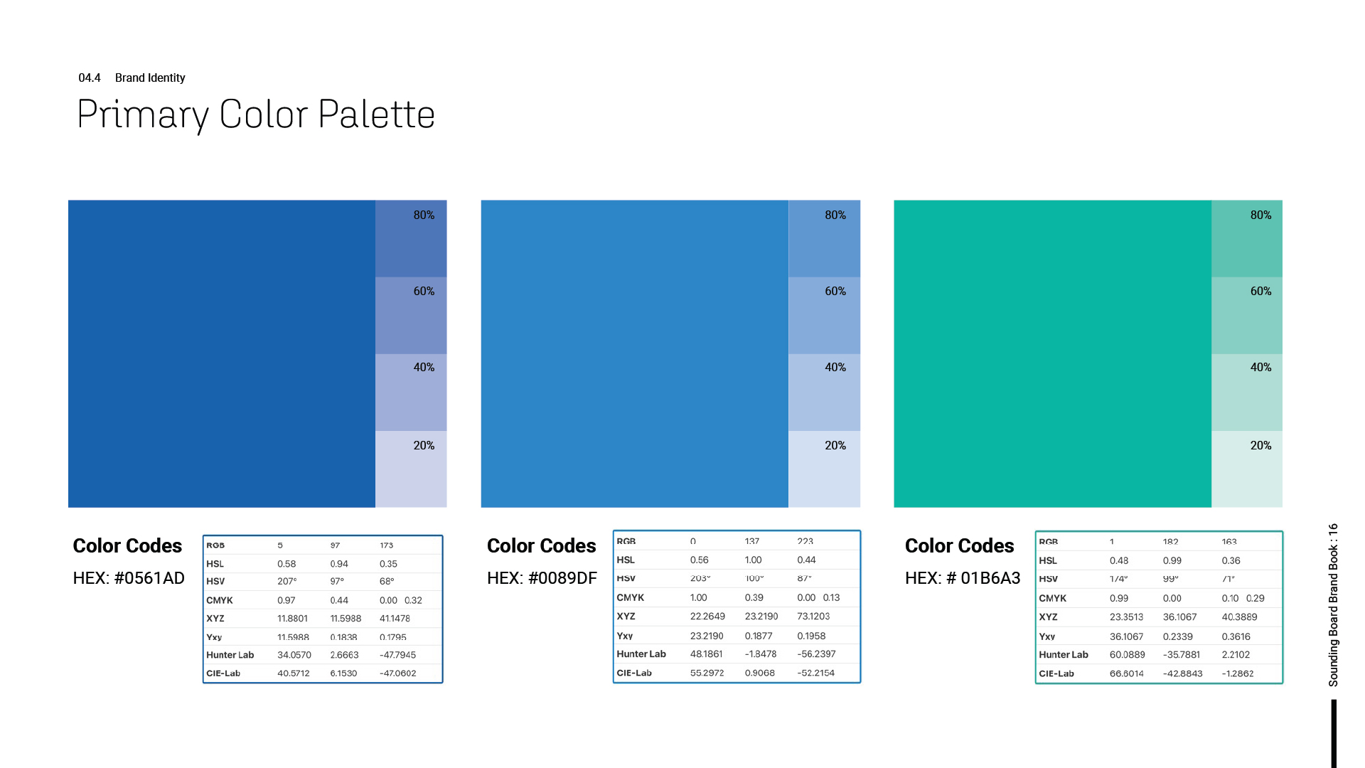
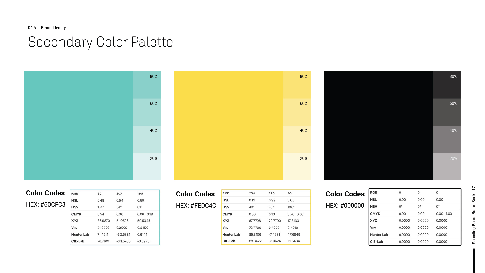
The visual identity was centered around a premium, professional aesthetic to appeal to C-suite executives and decision-makers in large enterprises. The color palette incorporates bold tones like #0561AD (blue), #01B6A3 (teal), and #60CFC3 (a soft green) to communicate trust, growth, and vitality, complemented by more neutral tones of black and white for contrast. The primary font is Roboto, a clean, modern typeface that conveys clarity and professionalism.
Images chosen to reflect the brand include scenes of collaboration, leadership in action, and diverse teams, reinforcing Sounding Board’s emphasis on people-first leadership and inclusion.
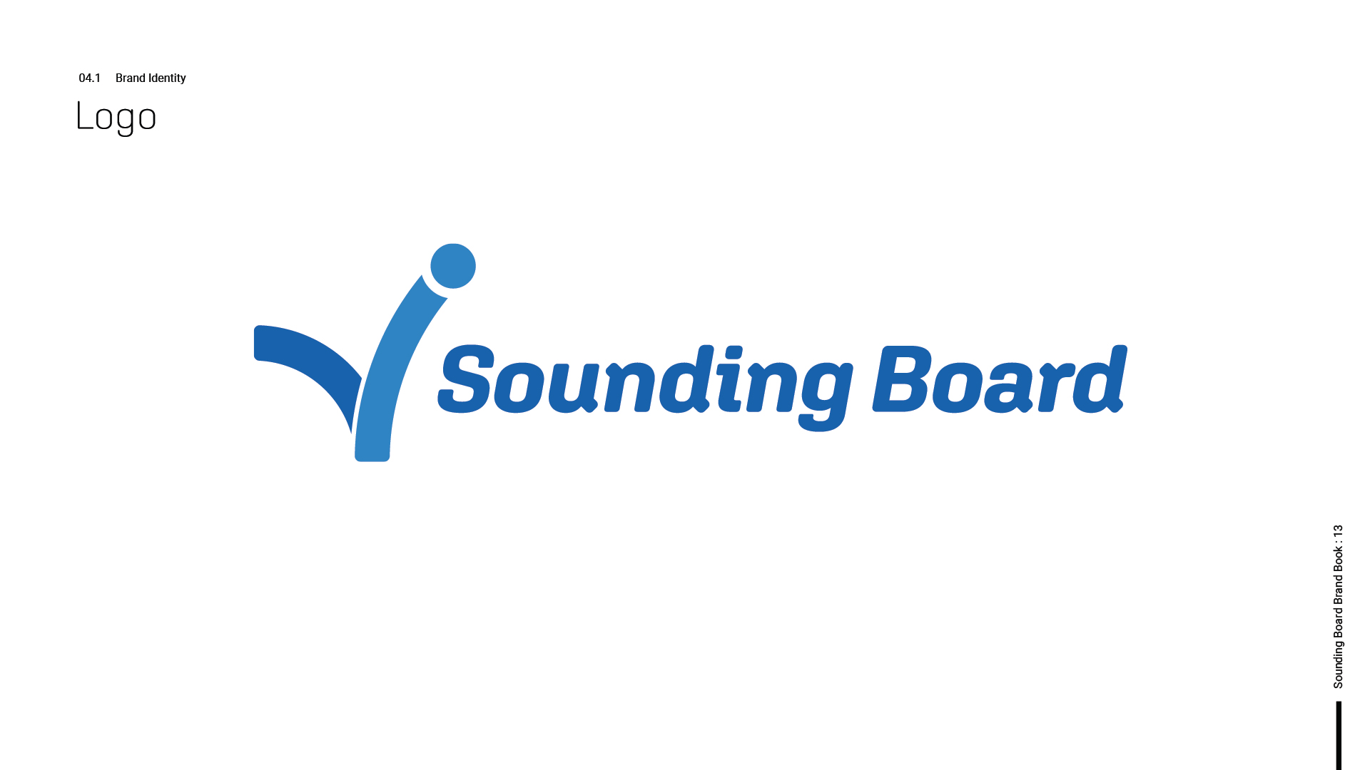
Logo and Iconography: The logo has been simplified and modernized to ensure it resonates with today’s leadership development market. It is adaptable, ensuring consistent use across all platforms and mediums. The iconography is designed to be minimal but impactful, complementing the platform’s focus on simplicity and clarity.
Outcomes & Impact:
This refreshed branding successfully communicated Sounding Board’s vision of transforming leadership development. The new identity has enhanced brand recognition, increased engagement with corporate clients, and helped position Sounding Board as a trusted partner for enterprises looking to invest in leadership and talent development.
By implementing a more cohesive brand voice, clear messaging, and a streamlined visual identity, Sounding Board has strengthened its market position as a premium, adaptive solution provider for leadership development.
Creative Studies
Leveraging Whitepapers for Lead Generation and Thought Leadership
Boosting Brand Awareness and Customer Conversion with Social Media Ads
Driving Lead Generation with Strategic Long-Form Content
Strategic Website Design Driving Revenue and Engagement for SaaS
Elevating Client Engagement through Strategic Video Production
Enhancing Brand Strategy with Impactful Case Studies


